Down the font legibility rabbit hole
While working on a recent project I was struggling with optimizing the readability of the content in the interface. The product is a safety-cricital interface used in aviation with lots of codes in small sizes. Good readability is crucial to make sure the users can do their job well and with as little fatigue as possible.
_-_The_Nursery_Alice_(1890)_-_BL.webp)
It’s 2019 and we can use a wide variety of typefaces on the web. Writing this post I realized it’s one of those things we quickly took for granted but the last few years were actually very exciting for web typography.
Web technologies changed. A lot. I remember using ImageMagick and GD in PHP to render headings as an image. Then we got sIFR when Flash was still a thing. But luckily those days are are long gone. Typekit (ahum, Adobe Fonts!) and Google Fonts paved the way for what we are capable of today. We can use a vast amount of great fonts and combine them with great looking display fonts to add character.
At the same time the resolution of displays increased significantly. There was the whole retina race, popularized by device manufacturers pushing for higher screen pixel densities. These displays made fonts more legible because you got more detail for text of equal size than on a non-retina screen. Especially on small form factors like smartphones this makes a big difference.
Type designers also started to optimize typefaces for reading on those small screens. Segoe UI, Roboto and San Francisco are great examples of typefaces that were carefully crafted to be legible at small sizes and on small screens. But just like interface design, type design also struggles with the balance between uniqueness and familiarity. Roboto was heaviliy criticized when it came out for its blandness and is still a faux pas in the design world. Typefaces like Ubuntu try to combine the best of both. Dalton Maag set out to incorporate Ubuntu’s tone of voice and free attitude into the typeface while keeping the glyphs very legible and familiar.
This balance between uniqueness and familiarity changes in a safety-critical context like aviation. Branding takes a backseat and safety overrules all. You definitely want familiarity and the inherent legibility that comes with it. This particular interface contains a lot of codes made up of letters and numbers: flight numbers (e.g. LH1337), stand numbers (e.g. A13C), aircraft types (e.g. B39M A330) and aircraft categories (A to F). And this lot gets blended with dates and timestamps. All of these codes can be very similar, especially when mixed without much context.
To make things worse there are two types of airline codes and depending on the type, they can have two or three alphanumeric characters. The flight number itself can be 1 to 4 digits. So it's impossible to know whether something is a letter or a number. You know it will end with a number but you don't know where it starts.
Legibility ≠ readability
This type of coded content puts a lot of pressure on the typeface when it comes to readability. I was wondering if the characteristics of a typeface could solve part of this problem. My knowledge about typography is rather basic and thus I had to start digging. I can highliy recommend the by now famous Web Design is 95% Typography (from 2006!) by Oliver Reichenstein and The best UI typeface goes unnoticed by Thomas Byttebier as primers on the subject.
I also stumbled on How Typography Can Save Your Life from Lena V. Groeger. It contains two interesting references from NASA and MIT that were relevant for me as well. There were also two terms that immediately popped up: legibility and readability.
Typographic clarity comes in two flavors: legibility and readability. Legibility is a function of typeface design. It’s an informal measure of how easy it is to distinguish one letter from another in a particular typeface. Readability, on the other hand, is dependent upon how the typeface is used. Readability is about typography. It is a gauge of how easily words, phrases and blocks of copy can be read.
In the safety-critical literature I found very few cues on what makes a font suitable for code-heavy HMIs. Most references talk about font size, font weight and color contrast. A typical requirement I found is: Font types and sizes should provide good readability at the intended reading distance
. No shit, Sherlock!
Font size, weight, color contrast, letter spacing etc. are of course all very important but a lot has been written about that already. So in this post I will only talk about legibility.
Thinking about legibility leads to the question: why are certain typefaces more legible than others? As the definition above states it's an informal
measure. The latest research shows that legibility is heavily influenced by conditioning: if you read lots of serif type, it will be more legible for you. But there are some ground rules that make some fonts more legible than others. And of course we're talking mostly about small font sizes because at large font sizes there's usually no problem. Until now I mostly based myself on trying out different fonts and testing the end result with users. I've never had any issues with legibility before but this project is different: you don't want a font to cause a wrong action.
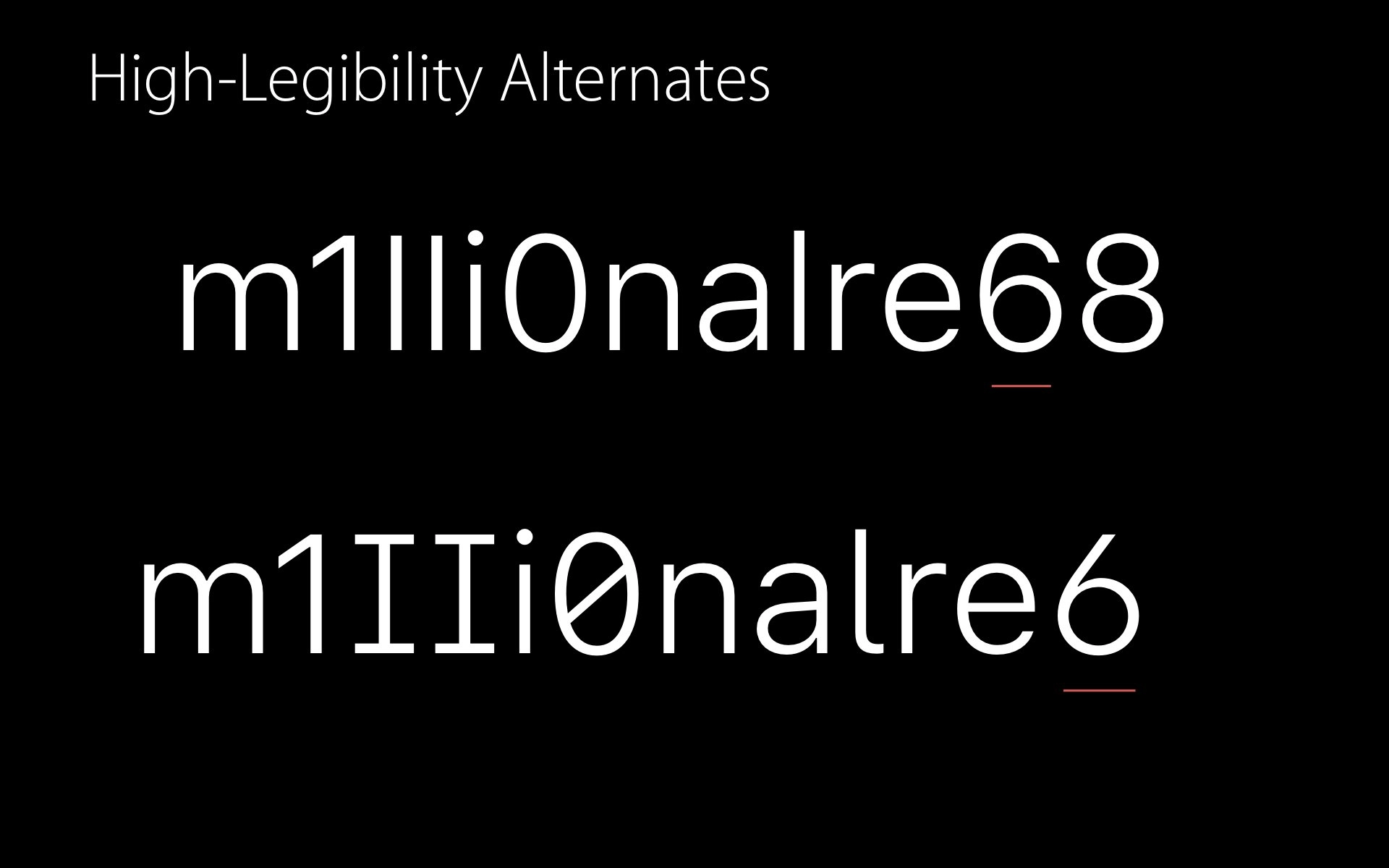
One of the best talks I watched on typeface legibility is from Apple's WWDC 2016 by Antonio Cavedoni, who worked on San Francisco. The level of detail that went into optimizing SF's legibility is mind-boggling. I especially like the slide about SF's high-legibility alternate, to be used in situations where the context is not enough to tell which glyph is which. As this was a web project it was clear from the start that San Francisco would never be an option because of its licensing. But I kept it around as a benchmark because it's so good and has so many great details.

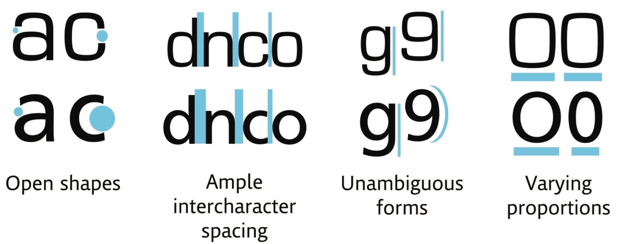
In 2012, MIT's AgeLab and Monotype developed a more streamlined methodology for testing the legibility of typefaces on screens under glance-like conditions. Their tests found that on average, a humanist typeface could be read accurately in shorter exposure times than a square grotesque typeface.

«Humanist genre typefaces are considered to be more legible because:
- Open space inside the letterforms prevent blurring their shapes
- Ample space between the letterforms prevent them from clashing or blurring together
- Highly distinguishable shapes to prevent ‘at a glance’ ambiguity
- Varied horizontal proportions to add distinguishing characteristics.»
Ariall the things
In safety-critical design it's sans-serif all the way because serifs can make text less legible on lower screen resolutions. Because of this, the sans-serif Arial has long been the gold standard for HMIs and is still widely used. It's ubiquitous and is available on most systems. It also has a large x-height which makes it perform well, even on low-res screens. Arial has little character and feels generic, which helps with the familiarity. But it does have some issues with numbers and the distinction between the I, L and l glyphs which make it less suited for my project.
Outside the safety-critical world there's a bit of a turf war between serif and sans-serif. But which one is actually more legible? Turns out serifs don’t automatically make type more legible (although they can help with character variation) and sans-serif simplicity is not always a plus
, says Fábio Duarte Martins.
Variable-width fonts outperform their monospaced variations for longer texts. But codes are very different from paragraphs. On top, a lot of monospaced fonts have optimized number glyphs to better differentiate them from each other and from letter glyphs. Zeroes often get a slash or a dot to set them apart from O's. In our case that immediately seemed like a big win for the legibility of flight numbers. There are also lots of false friends like B and 8, S and 5 and of course I, l and 1 that need be clearly different.
The proof of the pudding
With a better understanding of what can make certain typefaces more legible than others I compared some of the usual suspects. I made a Figma document and put the same piece of text in different fonts and different sizes next to each other. For the sample text I used a combination of typical glyph problems like B8, S5 etc. and added some common aviation data.
Above 12 points there's almost no problem at all. The real test is at smaller sizes. Based on this we drew some first conclusions for these fonts at small sizes:
- Monospaced fonts perform better for codes like flight numbers
- Slashed zeroes work better than dotted 0's or normal zeroes, especially when glancing or when the text is moving
- Geometric fonts like Exo really fall apart
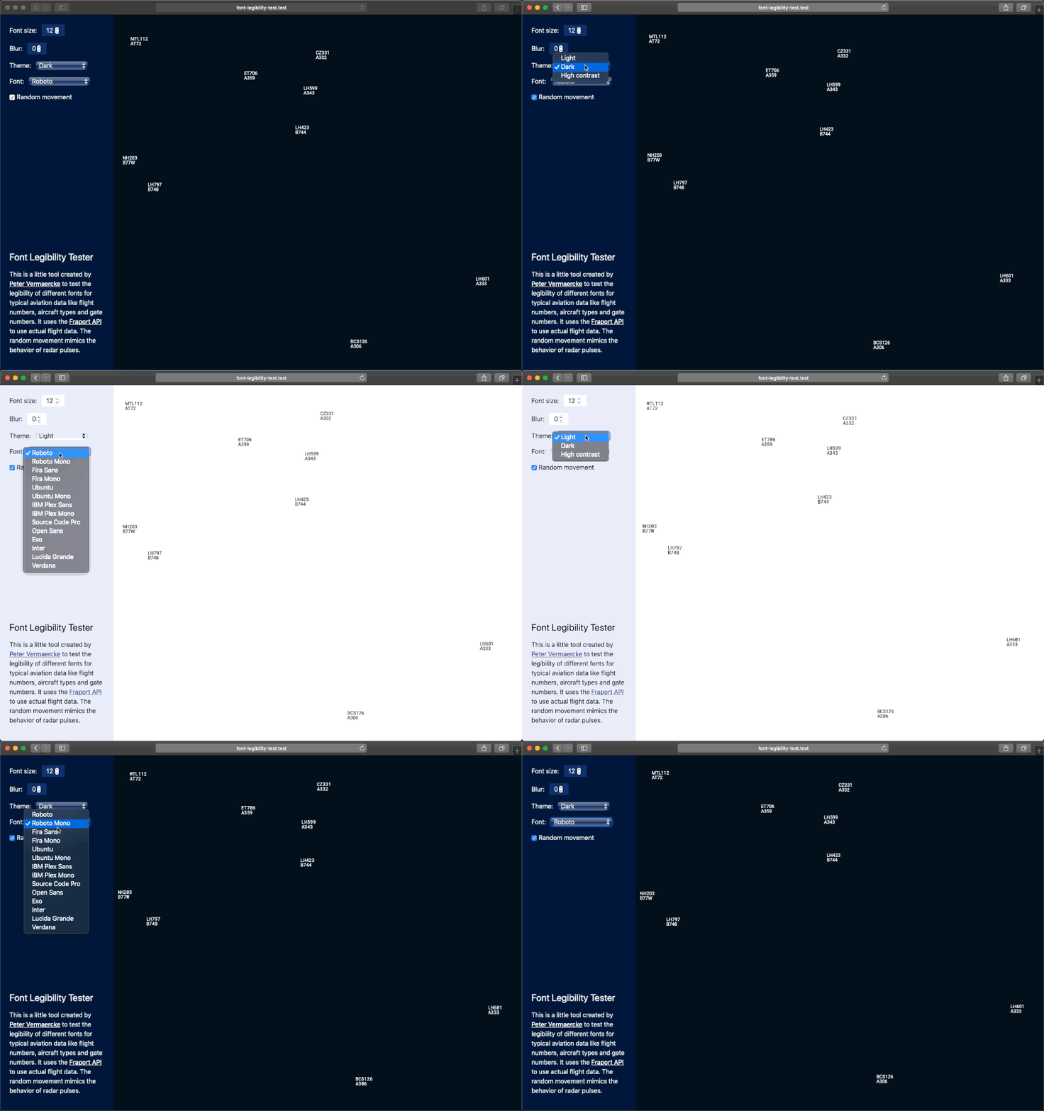
At that point we had some very good candidates like Roboto Mono, Inter, Plex Mono and Ubuntu Mono. Because the proof of the pudding is in the eating I needed a more realistic stress test to evaluate the different typefaces. I created a simple tool that pulls in live flight data from the Frankfurt airport API and spreads the flights randomly on the screen. To make it more realistic I added some random movement to each flight to mimic the way the radar pulses. An extra blur can give an indication of how legible the glyphs are when glancing at the screen.
See the Pen SF Pro High-legibility alternates by Peter (@pvermaer) on CodePen.
Some of the faces I selected have OpenType features. These are small variations included in the font file that can be activated to tweak the glyphs. There's one feature that was escpecially interesting to me: slashed zeroes! Typefaces like Inter and IBM Plex Mono support this feature. You can turn it on with just a single line of CSS: font-feature-settings: 'zero';.

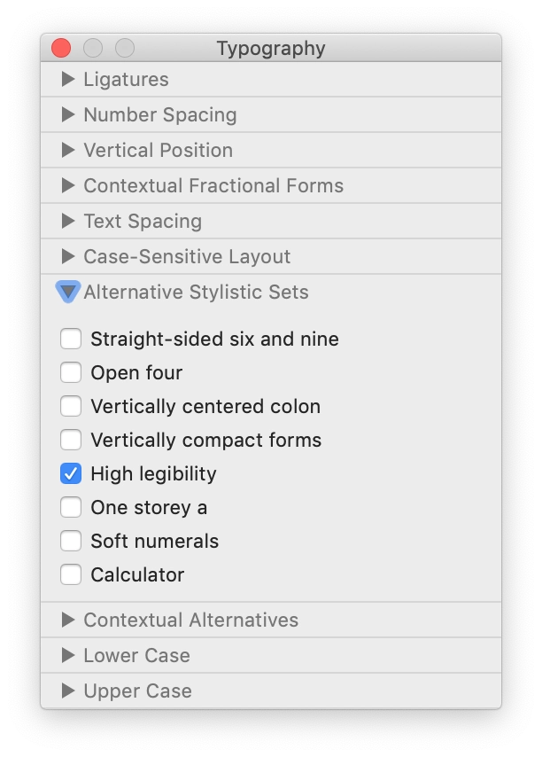
The high-legibility alternates in San Francisco can be turned on and off with CSS too. In this case by using stylistic set 06. In an application like Pages you can see these stylistic sets with their actual names. Each font can have up to 20 stylistic sets and they’re not mutually exclusive so you can combine tabular numbers with the high-legibility alternates.
I noticed it's a bit of an obscure area and it's not easy to find out which features a font supports. Inter, created by Rasmus Andersson, is a welcome exception and offers a clear overview of all its OpenType features.

Eventually we decided to go for Roboto Mono because it performs really well at small sizes, is Apache 2.0 licensed and has exceptionally clear numbers. You can try the Font Legibility Tester for yourself.
More importantly I'd argue the days of Arial are numbered. With so many great and legible typefaces available we shouldn't have to rely on Arial anymore. I'd recommend to try some of the typefaces I selected and see if they work for your needs. If you have any font suggestions, please let me know @pvermaer!