Data-driven design Pt. II
Prototyping with real data
A few years ago, Josh Puckett wrote a stellar article about his future vision for modern design tools and how they could incorporate real data. A lot of improvements have been made to our design tools but there are still so many possibilities. Easily tapping into live data without the need for code remains the Holy Grail. But he argues: Working with real data is as much about a mental shift in our thinking as it is having better tools
. And that’s what I will look at in the second part of this series.
Unit testing
Once we have our conceptual design, we can start creating mock-ups of our product. For this phase I like to see real data as form of unit testing. Unit testing is an automated process used by software engineers to make sure the code they write works as intended. If I enter this value, do I get the outcome I expect? The same goes for design I think. Designing with real data is like running unit tests on your designs. If I plug in these data, does my design still work? As an interaction designer I’ve been using scenarios of use to run through a concept to see if it works under the load of typical use. I believe we should use data in the same way. Real data are a way to stress test your design.
This type of unit testing goes much further than just verifying label lengths. Given real data: is the information hierarchy still clear? Is there enough variation in the data to easily distinguish different items? A lot of issues might come to surface when you start running this kind of tests. Otherwise these issues come up during an acceptance test when most code has already been written and design changes are very costly.
Design tools
Figma has been the rising star of the design tools and is my current tool of choice. The performance of a web app outshining native software? Yezzir, I had to see it to believe it. But in terms of using data it still lags behind other tools.
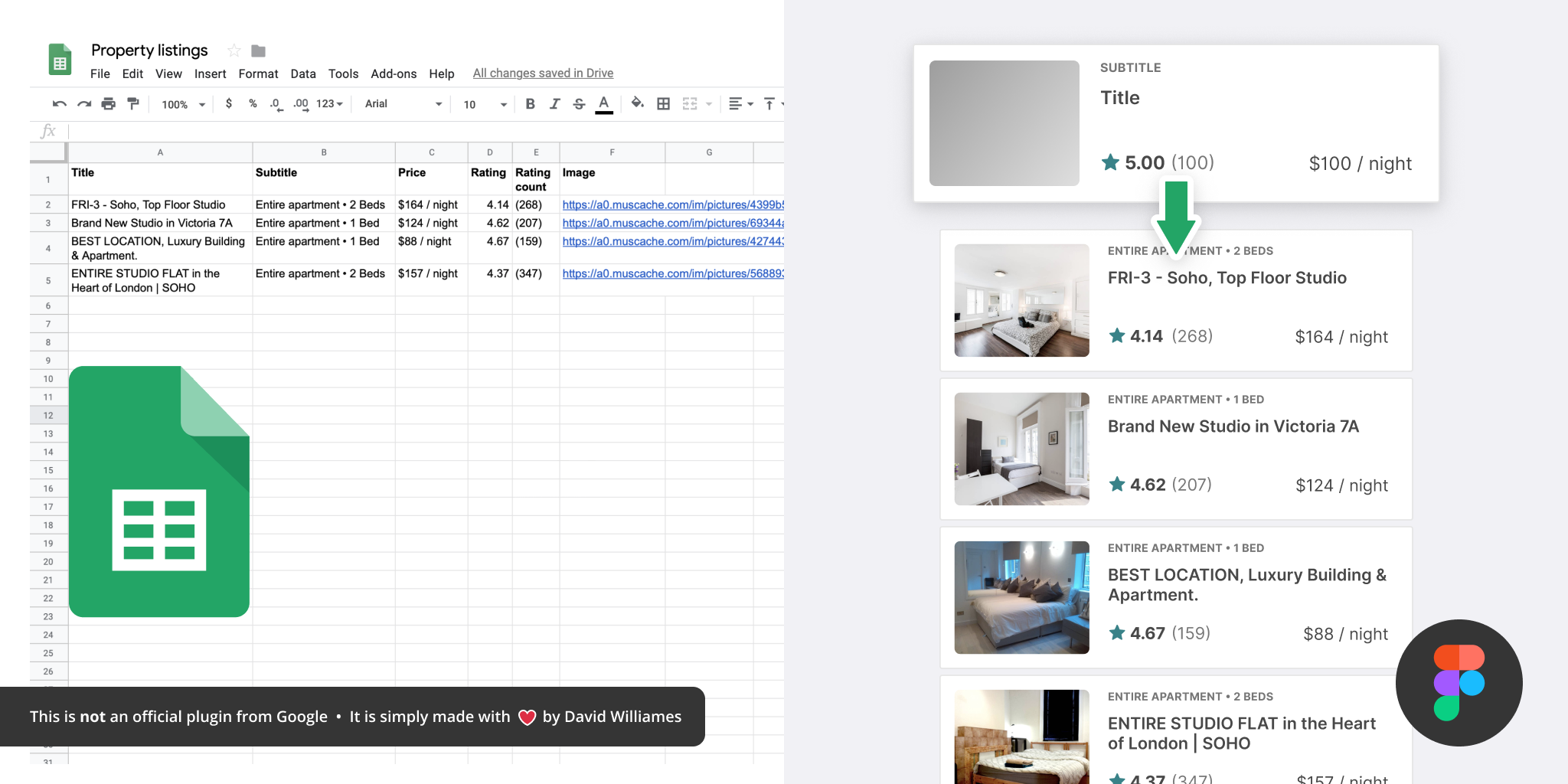
They recently added long-awaited plugins and that immediately resulted in some very interesting possibilities. One of my favorite plugins is Google Sheet Sync. It does what it promises: it pulls data from a Google Sheet and plugs it into your design. This is a great addition and allows you to use real data (even images) in your designs.
Other tools like Sketch and Adobe XD offer more data integration, although also mostly through plugins. Sketch has Invision Craft which can handle raw JSON. Both also support the powerful Data populator which is far more mature approach than in Figma.
3 levels
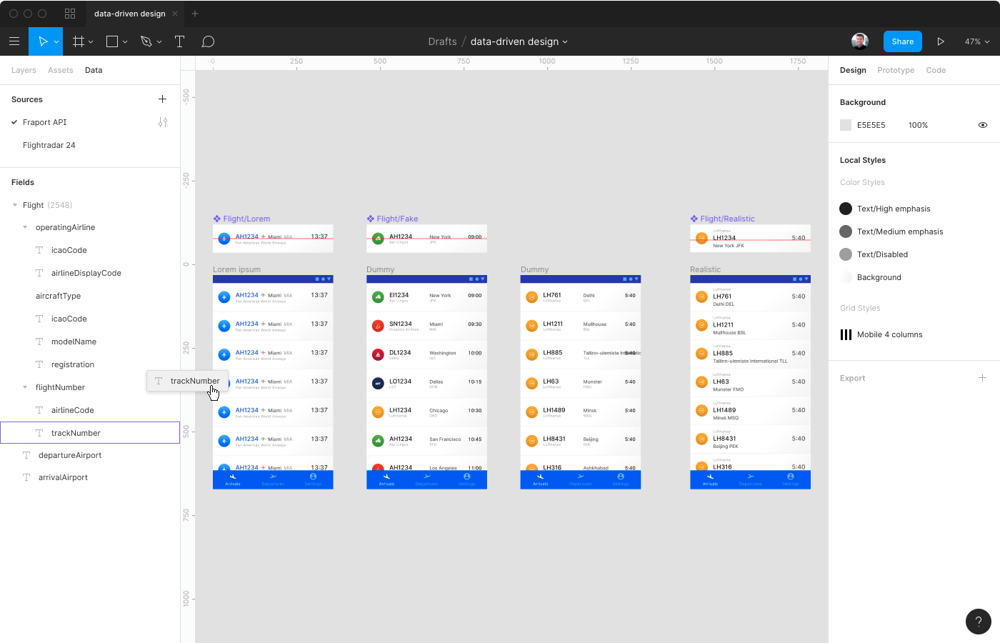
Let’s have a look at a fictive app for airport staff to check the arrivals and departures at their arport. When it comes to using data in mock-ups, I see roughly 3 levels. The first level can generally be described as the Lorem ipsum. The text in your design is filled with random pieces of text. I don’t think anyone’s still convinced that this has any value, so let’s quickly forget about it.
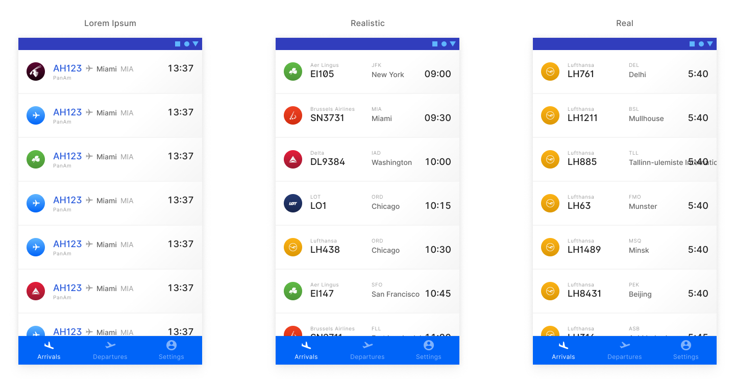
The second level uses seemingly realistic data and I call it The Dribbble. It’s that happy place where every user has a beautiful avatar, a short and punchy bio, no data are missing… It’s the kind of UIs you see indeed all over Dribbble and Behance. This is arguably more dangerous than using Lorem ipsum because at least with the Latin phrases everyone understands this is not realistic. And it’s absolutely not. The shit hits the fan only when the product is developed and the engineers connect the back-end and real data starts flowing in.
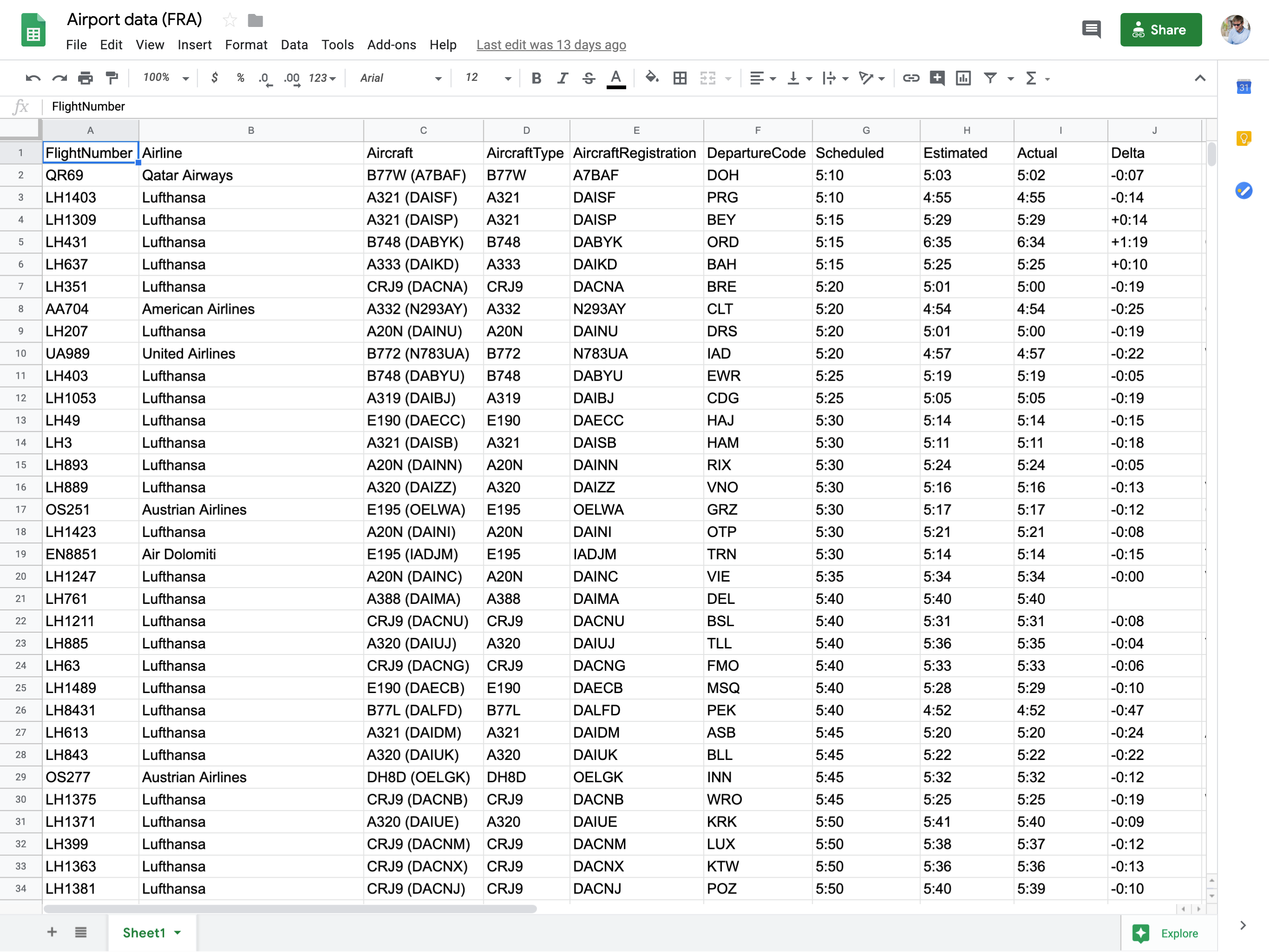
Which brings us to the third level, where you populate your design with real data. Not realistic, but real. Just like the data that will be used to populate those screens once your product or service goes in production. This is where you really start to find issues. No cherrypicking, just the kind of data a user would see if she opened the app on an early morning. Here I’ve pulled in data directly in Figma with the Google Sheet Sync plugin.
Now what do we learn from this?
-
Obviously some airports have long names. Guarulhos – Governador André Franco Montoro International in Brazil is the longest name I could find and Wa in Ghana the shortest.
→ We need to make sure our label placement can handle these extremes. Not only very long but also very short because it makes the hierarchy less obvious.
-
Because Frankfurt is a Lufthansa hub, a lot of flights have a very similar flight number because they all start with LH.
→ We need to make sure our font choice is well-considered to make the flight numbers easily scannable. At the same time we should avoid too many redundancies (logo, full name and flight number).
-
A lot of flights arrive at the same time.
→ This depends on the policy of the airport but in major hubs this is typically what airlines push for (the same for departures). We can’t expect the user to quickly find a flight based on the time of departure or arrival alone.
-
Some data are missing, irrelevant or wrong.
→ We need to make sure to have a design that doesn’t break if a value is wrong and doesn’t misguide our users if it’s missing. An undefined value is just as important as a defined one in this context. Here we need to think about what kind of decisions our users need to take based on this. If a terminal or gate hasn’t been set yet, it may indicate the plane will not arrive on time. In our design we need to make sure undefined values are clearly shown. If relevant for the user, we may go even further and highlight undefined items so they stand out.
Onwards and upwards
I believe we are currently in the Golden Age of design tools. Sketch, Figma, Framer, XD… are all racing to get ahead and us designers benefit from this competition. Looking back at Josh’s article you can see a lot of tools have implemented similar ideas. Most of them also iterate very quickly and push new features every month or even week.
Some design tools like Framer X can actually work with live data but it comes with a Matterhorn-steep learning curve. Too steep I believe, to really take off. Most designers won’t know React well enough to use this efficiently. It might stay around as a niche product that works great for some product teams (especially if React is part of your team’s technology stack) but that’s about it. Even with the component store there’s still advanced coding involved and that will just block a lot of designers from using it, despite their continuous efforts.
Sketch and Figma currently support data mostly through plug-ins. Of course these plug-ins will continue to evolve but it will never become very intuitive unless these functionalities are built-in. Sketch allows you to read random values from a text file but that’s really it. It’s a start (but not much more than that) and it shows us how data could be better integrated into design tools: you want access close to the input values, not hidden in a plug-in window.
But how could data be better integrated in the design process? Let’s have a look at tools used for data analysis. They’ve been around for years and some of them let you easily play around with data, even coming from live sources.
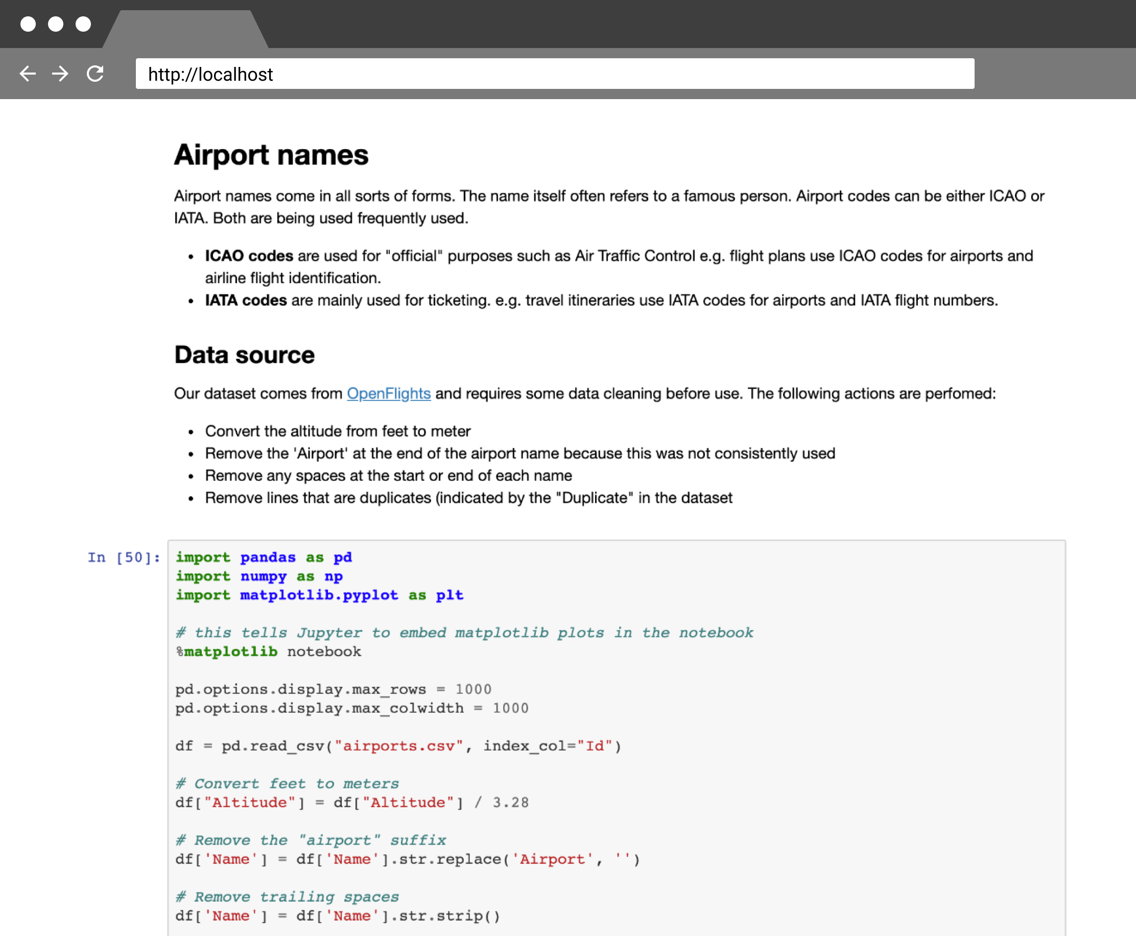
One interesting project to document your findings at the start of a project is called Jupyter Notebook. Each notebook can combine many different types of content like images, code, plain text, markdown, HTML… and everything is rendered live on the page. This makes the whole experience very fluid. But what’s amazing is you can visualize the data straight from your document, share the results and let others add comments. These notebooks are becoming increasingly popular in the data analysis world. It’s a well maintained open source web app but it undeservingly doesn’t have the same hype around it as Airtable or Notion.
Give it a try if you’re looking into keeping track of your product’s data exploration! A notoriously data-driven company like Netflix is using it as a central part of their data analysis workflow. Within their notebooks, the Netflix data scientists have access to the whole Netflix API so they can run all kinds of queries and do analysis on the output. I think Jupyter notebooks can be an ideal central place to keep track of the inspiration, data and lessons learned in a project. Everyone has access to the same data and can easily collaborate.
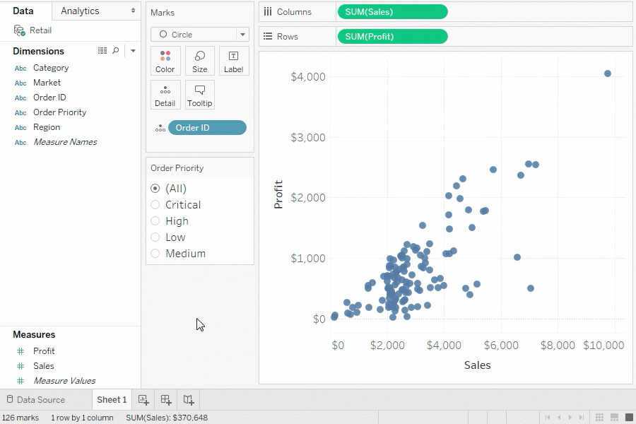
When it comes to prototyping, a source of inspiration could be the powerful data visualization suite Tableau. The data panel lists all your dimensions and measures. Dimensions are categorical fields like dates and categories that you can use to splice your data. Measures are metrics or numbers that are often continuous so you can calculate mathematical functions on them. Tableau offers a drag and drop interface that lets you use all these values.
You can drag and drop values and directly manipulate the data. I believe this direct manipulation of data will be crucial for prototyping and mock-ups. This is something Bret Victor has been promoting for years. We could imagine a data panel like Tableau in Figma as well. It would consist of:
- A list of data sources, similar to Layers and Assets. For each data source you can set parameters (like GET and POST)
- The possibility to link data to input fields and other values like colors or images
- A preview function to load in some of the content, with an offset for the results
- See the live data in Present mode
In my experience, using real data significantly speeds up the design process because you can come to great results quickly. It has helped me come to innovative ideas during the exploration phase. I waste less time making and updating mock-ups of interfaces. In usability tests you get very detailed feedback because the real data allows participants to fully immerse themselves in a scenario. When I’m handing over my work to developers, they feel more confident the design won’t break once they connect it to the back-end.
So if you haven’t done so already, try it on your next project!