Data-driven design Pt. I
Gathering data for your design project
This is not the millionth article that will tell you to base your UX decisions on an obscure combination of metrics. Data-driven can be taken quite literally: using real data in the design process from start to finish. This is an overview of where we are now and what lies ahead. In part 1 of this series we’ll look at how you can gather data.
I’ve recently worked on several data-heavy web applications in aviation. This industry runs on loads of data and it triggered me to write this article and share best practices about using real data in the product design process.
tl;dr Stay away from fake or seemingly realistic data and use as much as possible the real thing.
D is for Data
Let’s first define data in the context of data-driven design. For me, it’s any type of data that can be used in the product or service or service you’re designing. This can be visible like the text and images you show in your app. It can also be completely invisible like the probabilities coming out of an algorithm to give suggestions to your users. In my case it was mostly flight and airport data. Mind you I’m not talking about realistic data, but real data. This meant actual flights from actual airports. We’ll see how very different realistic and real can be. Don’t imagine what real content could be like, just use the real thing.

But maybe you ask yourself, why go through the trouble of using real data in your design projects? First of all it will make your design more robust, leading to a product or service that is better suited for its intended use and users. It also means less surprises at the end of a project which results in less quick-fixes during development and an overall shorter time to market. We might associate data mostly with prototyping but don’t forget the creative aspect too! Using data can spark connections that would otherwise remain undiscovered.

Data, where art thou?
Already at the start of a project you can check what kind of relevant data you have access to. This can be anything from real content to APIs or database dumps. Anything you can get hold of that is relevant for your product or service. IOT projects are typical examples where you may have access to a lot data that could improve the overall user experience.
If you’re working on something totally new there might not be much around. Try looking for something similar that comes as close as possible. Do a quick brainstorm with your team to think about what is possible before jumping into the conceptual design. Luckily there are also plenty of open APIs that you could use for your project. In my case I had to resort to data from Fraport and OpenFlights. Zach Johnston tweeted this interesting idea:
“Someone should build an Unsplash for data sets.”
He does have a point: why is there no Unsplash for data? There are some platforms like Kaggle and Dataset list that could be a starting point for your project. These APIs will often return data in JSON format. This can be useful for some plug-ins but often it’s handier to be able to open the dataset in Excel or Google Sheets. Use an online tool to convert JSON data to CSV. Save the output as a .csv file and you can open it in Excel or Google Sheets.
Data analysis
At this stage you may want to look more into data analysis. Excel is great for small datasets but once you have access to a lot of data, you might reach its limits. Microsoft has a free version of Power BI that can help you visualize and explore the data. If you have some experience with coding, tools like pandas will give you data superpowers. Among many other things, it can help you get a better understanding of the data you’re dealing with. Data science is a fascinating field but as a designer this can be very daunting. If this tickles your fancy, try following an introductory course like Analyzing Data with Python.
Anyone who’s ever worked with datasets knows the pain of missing or faulty values. This is the reality we need to accept: in the real world there is no such thing as a perfect dataset. Looking at actual data will help you discover holes in your data. But understanding the data also means you can leverage them to create a better product or service. A lot of low-hanging fruit typically goes unnoticed because nobody takes the time to dig a bit deeper than the values that are on the surface.
Data as a Stakeholder
You can see the data you’ve gathered as stakeholders in your project. Early on in the design process they have a story to tell. These stories can be a great source of inspiration that can help spark ideas, just like any other stakeholder. Let’s say you need to design software to be used by the staff at an airport. Before you start drawing or even before you do field studies it’d be good to get a better understanding of the context.
Learn how to see the bigger picture in a dataset to derive some trends or recurring patterns and use it to strengthen the concept of your product or service. For example as the European airspace is getting more and more clogged, delays are becoming the norm rather than the exception. If most flights will have delays, highlighting delays in your UI will take too much attention. Do more flights get cancelled than 5 years ago? What are the busiest days for a given airport? Getting an overview of these data will help you ask the right questions and set the right constraints for your design.

For the conceptual design we get the product owners and engineers together in the room to help spark connections. We usually try to have a wide variety of roles attending the conceptual design workshop. Depending on the project this can go from marketing to legal to business to IT. Data is usually the territory of back-end engineers so make sure to reach out to them ahead of your workshop or have them join the workshop. As a designer you don’t have to be the one who does all of the data wrangling but you can be the one who starts the conversation.
What are the odds?
If your product or service includes the most overused abbreviation of the last decade (AI) then you definitely owe it to yourself to use real data to design with. Artificial intelligence and Machine Learning are slowly making their way into a lot of products we use every day. As designers this means we need to learn how to deal with probability. Because for AI, probability is everything.
Josh Clark’s thought-provoking The New Design Material gives a great overview of the impact this will have on our design practice. He reminds us that all of the most successful digital products now have machine learning either at their core, or as an important enhancement to the core offering
. This means us designers need to learn how to deal with the underlying probabilities this is bringing along. Check with the developers what kind of data are used to come to what the user will eventually see in your product.
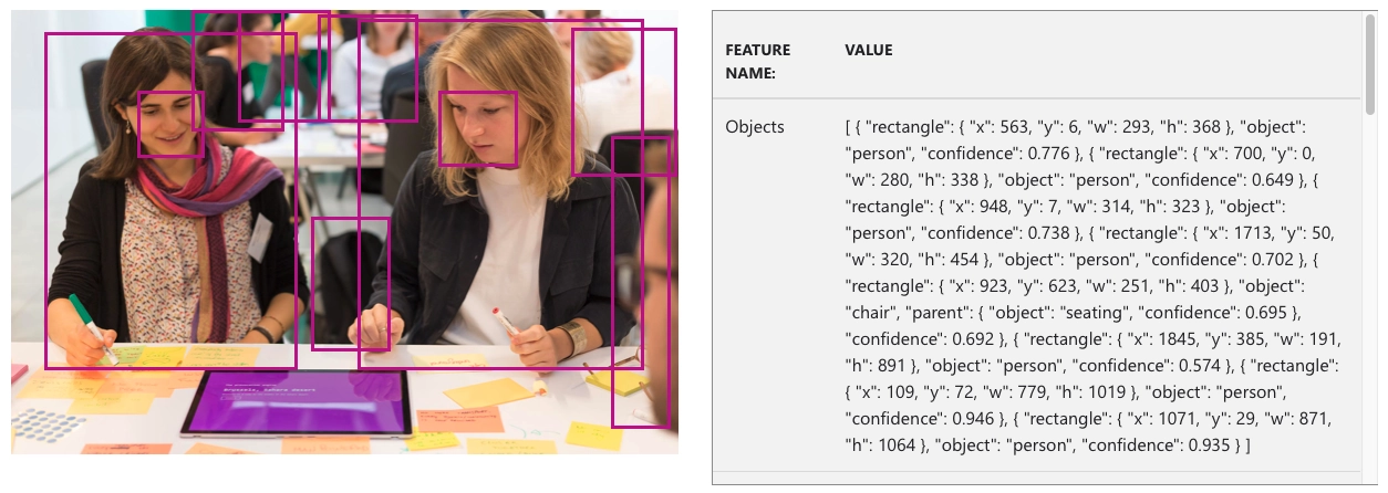
As an example, let’s look at some of the data we get back from Microsoft’s Computer Vision service. You notice the confidence for each recognized object. 0 being the lowest and 1 being the highest. There are no absolutes here, so don’t present them in your design as such. Depending on the image, you might get very wrong results.
[
  {
    "rectangle": { "x": 923, "y": 623, "w": 251, "h": 403 },
    "object": "chair",
    "parent": { "object": "seating", "confidence": 0.695 },
    "confidence": 0.692
  }
]
Knowing what range of probabilities you can expect can help you make the right decisions about how you can show these data and what the right tone of voice is. This is something you can only find out by playing with the actual data. Only in the context of your project you can decide whether 69% confidence is good enough to call something a chair or not. If you’re showing an irrelevant ad to a user it may not be a big deal. If you’re categorizing people as gorillas, it is a very big deal. I don’t know
is often better than a wrong answer and our UIs should reflect that too.
Should designers…
So after the ‘should designers code’ is this the new ‘should designers know data science’? No of course not! If anything, us designers should help start the conversation and represent the user in this discussion. If you have a data department, all the better! Include them in your process and learn from their expertise to make a better product or more solid service. If you don’t have a team then I hope I showed you how using data in your design process doesn’t have to be difficult or time-intensive.
In Data-driven design Pt. II we’ll continue with prototyping with data.